ファイル:2017- Donald Trump veracity - composite graph.png

元のファイル (2,775 × 1,750 ピクセル、ファイルサイズ: 141キロバイト、MIME タイプ: image/png)
ウィキメディア・コモンズのファイルページにある説明を、以下に表示します。
|

|
このグラフ画像は、ベクターイメージである SVG ファイルとして再作成されるべきです。これにはいくつかの利点があります。詳しくはCommons:Media for cleanupを参照してください。この画像の SVG 形式がすでに利用可能である場合は、アップロードしてください。アップロード後、この画像にあるこのテンプレートを{{Vector version available|新しい画像ファイル名.svg}}テンプレートで置き換えてください。
|
概要
| 解説 |
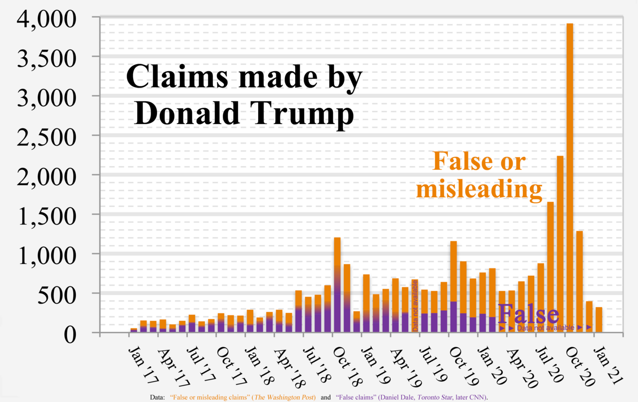
English: Chart of Donald Trump's “False or misleading claims” (The Washington Post) and “False claims” by Daniel Dale (Toronto Star, later CNN)
Technical details:
|
| 日付 | |
| 原典 | 投稿者自身による著作物 |
| 作者 | RCraig09 |
| その他のバージョン |
 |
Source data
- Data used to form fact check from The Washington Post is in image description page for File:2017- Donald Trump - graph - false or misleading claims.png
- Data used to form Toronto Star / CNN graph is in collapsible text:
- Versions 1 through 4:
| Click at right to show/hide data for Toronto Star / CNN portions (center of "error bars" in Versions 1-4) |
|---|
|
Month False statements |
- Version 5+:
| Click at right to show/hide data for Toronto Star / CNN portions (below, inside, and above Gradient regions in Version 5) |
|---|
|
Each three of the following data items are "stacked" (violet, below gradient, below orange) to form a full-height column. Month MIN GRADIENT WashPost |
ライセンス
- あなたは以下の条件に従う場合に限り、自由に
- 共有 – 本作品を複製、頒布、展示、実演できます。
- 再構成 – 二次的著作物を作成できます。
- あなたの従うべき条件は以下の通りです。
- 表示 – あなたは適切なクレジットを表示し、ライセンスへのリンクを提供し、変更があったらその旨を示さなければなりません。これらは合理的であればどのような方法で行っても構いませんが、許諾者があなたやあなたの利用行為を支持していると示唆するような方法は除きます。
- 継承 – もしあなたがこの作品をリミックスしたり、改変したり、加工した場合には、あなたはあなたの貢献部分を元の作品とこれと同一または互換性があるライセンスの下に頒布しなければなりません。
ファイルの履歴
過去の版のファイルを表示するには、その版の日時をクリックしてください。
| 日付と時刻 | サムネイル | 寸法 | 利用者 | コメント | |
|---|---|---|---|---|---|
| 現在の版 | 2021年2月9日 (火) 06:23 | | 2,775 × 1,750 (141キロバイト) | RCraig09 | Version 16: Eliminate Oct 2016 as irrelevant date to include. Reduced filesize at tinypng.com |
| 2021年2月9日 (火) 06:08 |  | 2,775 × 1,750 (140キロバイト) | RCraig09 | Version 15: Update to include final data for January 2021. Reduced filesize at tinypng.com. | |
| 2021年1月16日 (土) 07:00 |  | 2,775 × 1,750 (520キロバイト) | RCraig09 | Version 14: Update to include Washington Post data for Nov and Dec 2020 | |
| 2021年1月5日 (火) 23:32 |  | 2,775 × 1,750 (588キロバイト) | RCraig09 | Version 13: Updated to include Washington Post data through October 2020. | |
| 2020年12月20日 (日) 23:39 |  | 2,775 × 1,750 (495キロバイト) | RCraig09 | Version 12: Update to include Washington Post data through end of September 2020. | |
| 2020年11月16日 (月) 07:24 |  | 2,775 × 1,750 (532キロバイト) | RCraig09 | Version 11: Updating graph to include exact value for August 2020 that no longer involves extrapolation for the last four days of the month. Washington Post added a few more days to their database. | |
| 2020年10月21日 (水) 22:28 |  | 2,775 × 1,750 (532キロバイト) | RCraig09 | Version 10: Update to include Washington Post data for July and August 2020. Had to expand vertical scale to accommodate new high in data value (for August 2020). | |
| 2020年7月13日 (月) 06:43 |  | 2,775 × 1,750 (522キロバイト) | RCraig09 | Version 9: updated to include Washington Post data for June 2020. | |
| 2020年6月5日 (金) 06:00 |  | 2,775 × 1,750 (515キロバイト) | RCraig09 | Version 8: Updating to include Washington Post data for April and May 2020 | |
| 2020年4月15日 (水) 20:29 |  | 2,775 × 1,750 (586キロバイト) | RCraig09 | Version 7: updated to include CNN data for Jan and Feb 2020 |
ファイルの使用状況
以下のページがこのファイルを使用しています:
グローバルなファイル使用状況
以下に挙げる他のウィキがこの画像を使っています:
- ca.wikipedia.org での使用状況
- en.wikipedia.org での使用状況
- he.wikipedia.org での使用状況
- hy.wikipedia.org での使用状況
- pfl.wikipedia.org での使用状況