ファイル:Budget Deficit and Public Debt to GDP in 2012 (for selected EU Members).png

このプレビューのサイズ: 800 × 600 ピクセル。 その他の解像度: 320 × 240 ピクセル | 640 × 480 ピクセル | 960 × 720 ピクセル。
元のファイル (960 × 720 ピクセル、ファイルサイズ: 65キロバイト、MIME タイプ: image/png)
ウィキメディア・コモンズのファイルページにある説明を、以下に表示します。
|
.png?uselang=ja)
.png?uselang=ja)
.png?uselang=ja&action=history)
.png)
概要
| 解説 |
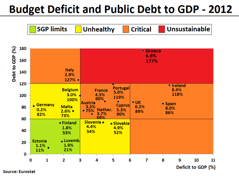
English: The Debt-to-GDP ratio and Budget deficit to GDP ratio have been plotted for all eurozone countries and UK in 2012. The same plot can also be found here with 2009 figures. The figures indicate the fiscal health of the countries in the plot. Generally, the farther up and to the right a country goes, the higher the risk for investors. The following 4 areas have been given a background color in the plot to reflect the level of fiscal health:
|
| 日付 | |
| 原典 | 投稿者自身による著作物. Data for the chart is from the Eurostat database[1][2], which normally will be identical with the European Commision's AMECO database[3][4]. In the current version of the file, the figures are based on recorded data for the first 3 quarters and forecasted data for the last 4th quarter of 2012. The data can also be found published by the European Commission's latest Autumn Economic Forecast 2012 report. |
| 作者 | Danish Expert |
| その他のバージョン | العربيَّة |
.png)
-ar.png)

|
このグラフ画像は、ベクターイメージである SVG ファイルとして再作成されるべきです。これにはいくつかの利点があります。詳しくはCommons:Media for cleanupを参照してください。この画像の SVG 形式がすでに利用可能である場合は、アップロードしてください。アップロード後、この画像にあるこのテンプレートを{{Vector version available|新しい画像ファイル名.svg}}テンプレートで置き換えてください。
|
ライセンス
この作品の著作権者である私は、この作品を以下のライセンスで提供します。
このファイルはクリエイティブ・コモンズ 表示-継承 3.0 非移植ライセンスのもとに利用を許諾されています。
- あなたは以下の条件に従う場合に限り、自由に
- 共有 – 本作品を複製、頒布、展示、実演できます。
- 再構成 – 二次的著作物を作成できます。
- あなたの従うべき条件は以下の通りです。
- 表示 – あなたは適切なクレジットを表示し、ライセンスへのリンクを提供し、変更があったらその旨を示さなければなりません。これらは合理的であればどのような方法で行っても構いませんが、許諾者があなたやあなたの利用行為を支持していると示唆するような方法は除きます。
- 継承 – もしあなたがこの作品をリミックスしたり、改変したり、加工した場合には、あなたはあなたの貢献部分を元の作品とこれと同一または互換性があるライセンスの下に頒布しなければなりません。
ファイルの履歴
過去の版のファイルを表示するには、その版の日時をクリックしてください。
| 日付と時刻 | サムネイル | 寸法 | 利用者 | コメント | |
|---|---|---|---|---|---|
| 現在の版 | 2012年11月30日 (金) 17:47 | | 960 × 720 (65キロバイト) | Danish Expert | Data extended to cover all Eurozone countries and UK for comparison. |
| 2012年11月30日 (金) 12:52 |  | 960 × 720 (55キロバイト) | Danish Expert | Changed definition for the Unhealthy area, so that it now is more directly related to the official European SGP limits. Meaning that a country now needs to comply with 1 out of 2 fiscal SGP limits (and not exceed by far with the second), in order to be... | |
| 2012年11月29日 (木) 17:12 |  | 960 × 720 (54キロバイト) | Danish Expert | Color top-legend added. Y-axis stopped at 180 instead of 200, in order to improve layout with some more whitespace around the top-legend. | |
| 2012年11月29日 (木) 10:26 |  | 960 × 720 (57キロバイト) | Danish Expert | Clarified the concept of "unsustainable levels" by introducing a red color for this particular window, and leaving the orrange color only to map the area commonly referred to as "critical levels". | |
| 2012年11月25日 (日) 18:54 |  | 960 × 720 (57キロバイト) | Danish Expert | User created page with UploadWizard |
ファイルの使用状況
以下のページがこのファイルを使用しています:
グローバルなファイル使用状況
以下に挙げる他のウィキがこの画像を使っています:
- ar.wikipedia.org での使用状況
- en.wikipedia.org での使用状況
- pt.wikipedia.org での使用状況
.png)